SaaS Explainer Video Conversion Guide


Want higher sign-ups without rewriting your pricing page for the hundredth time? A well-crafted SaaS explainer video can do the heavy lifting, fast. This guide walks you through why explainer videos convert, what elements actually move the needle, and how to test and iterate until your video becomes a reliable conversion engine.
Why SaaS Explainer Videos Work (and Why You Should Care)
Explaining software is hard. SaaS products often solve abstract problems, involve complex integrations, or require a detailed runbook of steps that can take hours to unpack. Explainer videos collapse that complexity into one human-friendly narrative. They reduce cognitive load, build trust quickly, and, most importantly, help prospects reach "aha" moments faster.
Let’s be honest: most visitors won’t read a long feature list. But many will press play for 60–90 seconds. That’s your window to show value, calm doubts, and point them toward the one action that matters: signup, trial, or demo.
If you’re still struggling to map your messaging, you might find it useful to explore what customer segmentation is and why it matters. Aligning your video script with the right audience segments is often the difference between average engagement and real conversions.
Core Elements of a High-Converting SaaS Explainer Video
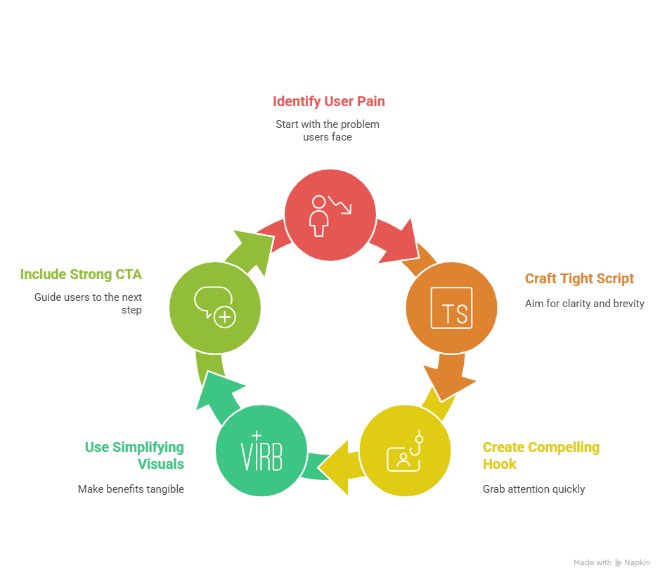
A great explainer video isn’t a tech demo or a cinematic short; it’s a conversion tool. Focus on these five essentials:
- Clear value proposition: Start with the problem your target user faces. Don’t begin with features. Start with pain.
- A tight script (60–90 seconds): Aim for clarity over complexity. 125–150 words per minute is a useful pacing rule.
- Compelling hook: Grab attention in the first 5–10 seconds. A question, a vivid scenario, or a surprising stat works well.
- Visuals that simplify: Use motion graphics for abstract flows; use screencasts to prove the UI works. Pick the style that makes the benefit tangible.
- One strong CTA: End with a single, obvious next step, “Start a free trial,” “Book a demo,” or “Get the guided tour.”
A quick checklist for your script: problem, then pain, then solution, then proof, then CTA. Simple, linear, and human.
Picking the Right Visual Style for Conversion
Style isn’t art school, it’s strategy. Match style to the message:
- Motion graphics/2D animation: Best for explaining abstract systems (data flows, AI, integrations). It simplifies the invisible.
- Screencast/product walk-through: Use when the interface itself is the proof. Nothing beats seeing the product in action for credibility.
- Whiteboard/typography: Great for educational B2B content or when you need to guide through a process step-by-step.
Budget tip: You don’t need Hollywood production to convert. Clear messaging and well-timed visuals usually outperform over-polished but unfocused videos.
Where to Place the Video for Maximum Impact
Placement matters almost as much as the video itself. Try these high-impact spots:
- Homepage hero (short, sticky version)
- High-intent landing pages (feature pages, pricing pages)
- Email campaigns (lead nurture and onboarding)
- Paid social ads (shorter cuts/teasers)
Pro tip: On your homepage, keep it concise and lead with the benefit. On landing pages, use a slightly longer version that walks through the key steps before the CTA.
To maximize your distribution strategy, consider pairing your explainer with on-demand demo solutions. These let prospects explore at their own pace, creating a seamless bridge between your explainer video and hands-on product experience.
Optimize for Conversion: Testing & Metrics
Don’t treat your explainer video like a museum piece; treat it like a hypothesis.
Track these metrics:
- Play rate (does the thumbnail compel clicks?)
- View-through/completion rate (do people finish it?)
- Replays and rewatches (which segments get repeated?)
- CTA clicks and conversion rate (the bottom line)
A/B tests to run:
- Hook variations (different opening lines)
- Length (60s vs 90s)
- CTA wording/placement (early, mid-roll, end)
- Thumbnail and poster image
Also consider embedding an email capture or lead form in the video player if your funnel favors lead-gen over immediate trials; capturing an email can be the soft win that starts a nurturing sequence.
Common Mistakes That Kill Conversions (and How to Fix Them)
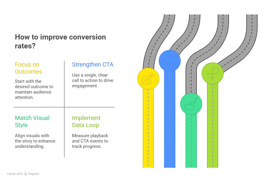
- Over-explaining: If your script spends too long on features, you lose attention. Fix: start with the outcome.
- Weak CTA: Multiple CTAs dilute action. Fix: pick one, make it obvious.
- Wrong visual style: Screencast for abstract architecture? Not ideal. Fix: match format to the story.
- No data loop: If you don’t measure, you don’t improve. Fix: instrument playback and CTA events from day one.
A Practical 4-Step Workflow to Ship a High-Converting Video
- Define your audience and ICP: Who exactly are you talking to? Narrow it down.
- Write the problem-solution script: Keep it emotional and concise, use "you" to speak directly to the viewer.
- Choose the style and produce: Screencast for UI proof, motion graphics for concepts.
- Launch + iterate: A/B test hooks, CTAs, and placement. Update every 12–24 months or after major product changes.
This iterative approach turns a video from a marketing artifact into a living conversion asset.
Conclusion: Make Your Explainer Video Pull Its Weight
A SaaS explainer video is not just an FAQ with pretty visuals. When planned and optimized correctly, it shortens sales cycles, improves lead quality, and multiplies conversion rates. Start small: craft a concise script, choose the right format, and treat the first version as a test. Then optimize relentlessly.
Ready to turn curiosity into signups? Start by auditing your highest-traffic landing page. What would a 60–90 second explanation change for visitors in the first 10 seconds?
FAQs
Q: What’s the ideal length for a SaaS explainer video?
A: Aim for 60–90 seconds for primary marketing explainers. Short enough to keep attention; long enough to communicate one clear value proposition.
Q: Animated or live-action, what converts better?
A: It depends. Animation excels at explaining abstract systems; live-action/screencast proves the interface. Choose what makes the benefit tangible to your buyer.
Q: Where should I place my explainer video for best results?
A: Homepage for broad awareness, targeted landing pages for intent-driven conversions, and email or ads for nurture and retargeting.
Q: How much does a professional explainer video cost?
A: Costs vary widely: simple motion graphics can be lower-budget, while polished screencasts or custom animation fetch higher prices. Focus on clarity and conversion rather than flashy production alone.
Q: How soon will I see conversion improvements?
A: If the video addresses the core friction and is placed on a high-intent page, you can often see measurable changes within a few weeks. But treat this as an iterative process—A/B testing will refine the gains.
Further Reading
Looking to go deeper? Here are some curated resources that expand on the ideas we’ve covered:
- Customer Segmentation: How to Segment Users & Clients (HubSpot Blog) — a clear, practical guide to segmenting customers for better marketing impact. Read on HubSpot
- The Ultimate Guide to Sales Demo Presentations (SupaDemo) — actionable tips to make your demos more engaging and conversion-friendly. See the SupaDemo guide
- How To Master Product Demos For SaaS Businesses (Userflow) — strategies for crafting demos that resonate and close more deals. Check out Userflow

Sarah Thompson is a storyteller at heart and Business Developer at PuppyDog.io. She’s passionate about creating meaningful content that connects people with ideas, especially where technology and creativity meet.